 7 minutes reading time
If you visit an e-commerce site, a travel site, or any website that presents users with multiple options, there will be some form of filtering and sorting function to help users choose the product they would like.
Every day, more and more people are choosing to shop online, and if they cannot use your site to find something they like or need, they may not use it again.
Why should you use filters and sorting?
Hick’s law states that the amount of time it takes for someone to make a decision increases with the number of options they must choose from. When implemented, filters and sorting will reduce thousands of products into manageable amounts and order these products to meet user interests and needs. Resulting in an increased likeliness of the user finding what they are looking for.
Therefore, if an e-commerce site wants users to buy from them, it makes sense for them to allow users to reduce the number of options they see and increase the likelihood that they will decide to make a purchase.
What is the difference between sort and filter?
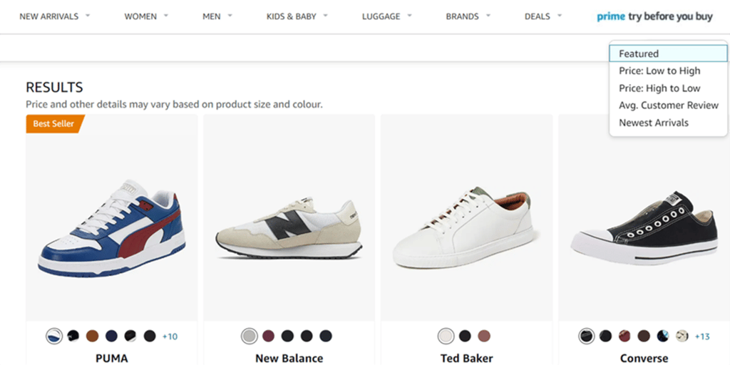
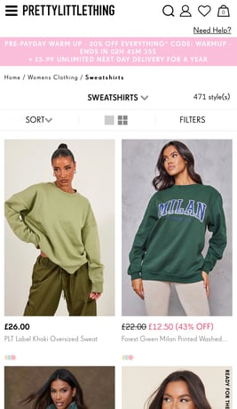
Sorting changes the order of the items, but the number of them visible to the user stays the same. Typically, these are things shared across all products: sorting options can include price (high to low or low to high), alphabetical order (A-Z or Z-A) or rating (high to low or low to high). Sorting allows users to systematically work through the product list in an order they understand.
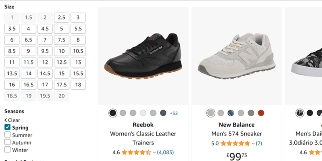
Filtering reduces the number of options to contain only those matching user-selected criteria. These include the characteristics of the products: colour, size or type. Depending on the department, users may also filter through unique categories. Both filtering and sorting allow users to take control of the products they see.
Now that’s ‘sorted’, let’s look at some of the best practices for using these features that help users find and select what they are looking for.
Make sure users can find them:
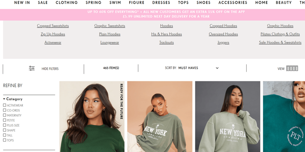
When conducting eye-tracking research, we regularly see users drawn to the top and top left area of the page, expecting to find the filter and sort options. When using a desktop, there is (usually) enough screen space to display both options, allowing users to quickly locate and use these functions.
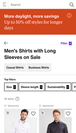
However, we tend to see some problems occur when the experience switches to mobile and designers are faced with the challenge of including numerous categories and options in a more confined space. A common solution is to hide all options behind a filter bar or a single icon that displays an overlay once the user presses it.
In doing this, the positioning of the filter and sort button varies from site to site. We often observe users missing these options and scrolling aimlessly up and down the page, searching for a method to filter and sort the products. There is only so much searching users will endure before they exit the site for a competitor.
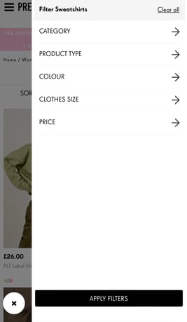
Therefore, when hiding mobile filters and sorting options behind a button, it’s important to consider the following things:
- Keep it at the top – user expectations of where to find the filters have not changed, despite changing the device. It can be a static button or a sticky element on the screen as long as the function remains at the top of the page.
- Do not rely on just an icon. In our research, we see users look directly at icons on mobile and desktop. However, because they are unsure what the icon is, they move past it. Remove any ambiguity by adding a label to the icon or removing the icon altogether. It does not take up too much extra room, but it will increase the chances of users knowing what it means and that it is what they are looking for.
Ensure the categories and options are relevant to users:
When people shop for things in a store, they do so based on a learnt experience of what they like, and in the case of clothes, what fits them and their style preference. They will look in a specific department (shoes, shirts, trousers), then find the colours or styles they like to narrow down the choices. Finally, when they have found an item, they will look to see if their size is available, which again is different depending on what item of clothing they want.
When it comes to filters, matching the user’s mental model of how they would choose something in the physical world is important in helping their choices on a website. If they cannot filter by the same categories, options, or language they have come to expect from their shopping experience, they are likely to struggle to find what they are looking for.
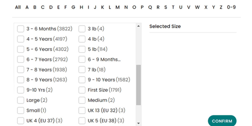
For example, when shopping for children's clothes in a store, a parent would know which items will fit their child based on the age range shown (3-6 months etc.). If they were shown the options for size in cm or inches instead of age when shopping online, they may struggle to know which one will fit their baby.
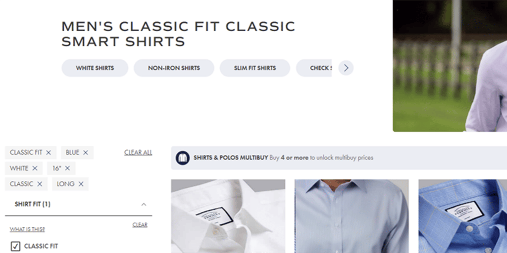
Problems can appear when you start using options that are too specialist. As only a select few users will understand these terms, you may confuse or alienate the casual shopper on your site. When shopping for shirts on Zalando, there is an option to filter by 7 different types of shirt collars.
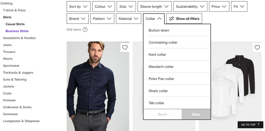
Most users may fail to understand the differences between these collar types and apply these to the item they have in mind. Charles Tyrwhitt has similar options on its website. Rather than leaving the user to guess which choice fits their needs or most likely ignore this filter option, they offer the chance to find out what these different styles are by having a guide hidden behind a ‘What is this?’ button.
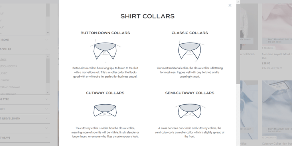
Having specialist terminology on filters is not necessarily a negative if you offer your users a way to see what it means. By giving your users this knowledge, they can continue using the filters to narrow their search to match their preferences.
As UX practitioners, we know feedback is a vital heuristic for the usability of a website. So, once users have found the filter and sort function, understood their options, and made their selections, it’s important to let them know their choices have been applied to the list of products.
Charles Tyrwhitt does this in two ways:
- First, they add a tick next to the filter categories.
- Secondly, the specific options chosen from those categories display above the results. This transparency provides a good level of feedback to the user.
Just as the lack of space on a mobile screen causes issues with the placement of the filter and sort options, so too can it cause problems with the feedback of a user’s selection. Designers must prioritise the amount of information shown to a user.
Zalando offers a neat solution by showing the selected filter options as a horizontal slider that states the number of filters applied in each category. The user has the option to quickly change any of the filters by tapping into each category.
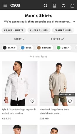
Asos add a simple tick to the filter button once it is applied and displays the number of products available to the user.
The topic of filtering and sorting on websites is much bigger than that which can be discussed in one article. These are a few of the best practices in place, but conducting user research is the best option to ensure all of the functions on your site are meeting user needs.
If you are looking for help in creating a human-centred design for your website, please get in touch with our friendly team.
 Author